So this week I thought I'd tell you the basics of what you need to know to start oil painting. From what tools and materials you will need to how to go about creating your painting. I've probably missed a couple of things out but I've certainly picked up some useful information through art college, art books, and experience that I can share with you.
I'm not going to be telling you HOW exactly you should paint. People want to paint different subjects in different ways and developing your own style is something that comes from practise and experience. This is intended to be a handy guide for anyone looking to take up oils.
So let's begin!
What you'll need:
Typically this is cotton or linen canvas but you can also work on wooden boards including MDF and hardboard. You can even paint on paper to a degree.
Canvas comes in various levels of coarseness. Some artists like roughly woven canvases to feed into the texture of their work whilst others prefer finer canvasses to allow small details to show through. You can buy canvasses already set on a frame or loose canvas which you can frame yourself. Framed canvasses come in both primed and unprimed states. Priming a canvas is important as the oils will absorb into the canvas which over time may lead to rotting. If you buy an unprimed canvas you will want to coat it in a few layers of acrylic gesso to create a good surface to paint on. Sand it down to create a finer surface.
When buying canvas check to make sure it has a smooth surface for you to paint on. Look out for any rips, dents or bubbles.
It's best to prime boards too to create a better surface to put paint on. You can paint on paper but as this is such a thin material it is even less durable and is best for sketches and studies rather than larger projects (ideally prime too). Be careful of the paper warping due to moisture. Oils can seep through paper relatively quickly.
The surface you paint on will affect drying time along with the thickness of paint and the mediums you use. I personally find that hardboard takes longer to dry than canvas.
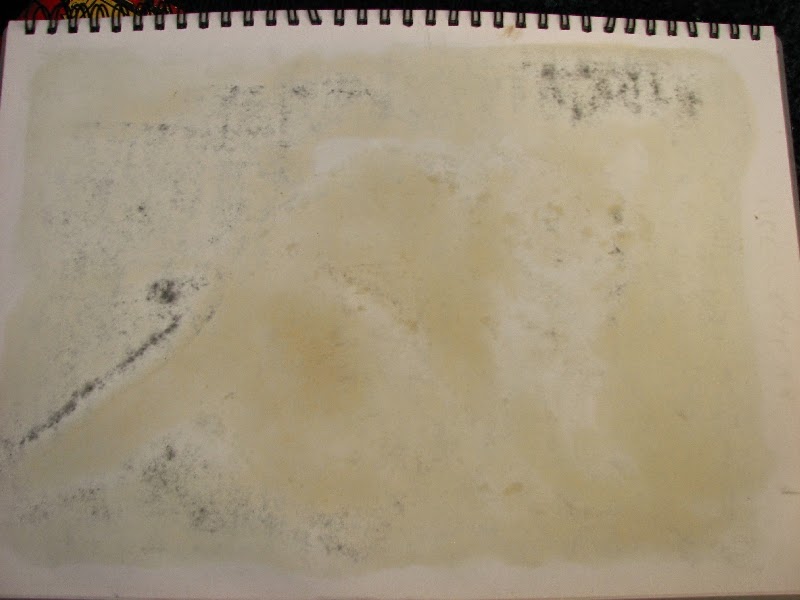 |
| Oils coming through the paper |
Technically you don't have to apply paint with a brush you can try out anything you want - plastic cards, fingers, sticks, but most artists use brushes to create accurate mark-making.
I recommend buying a wide selection in brush sizes. Use broad brushes to paint large areas and to apply gesso, and finer pointed brushes to work on small details. You don't want to be covering a massive canvas using a tiny brush - it will wear it out plus take forever! Brushes come in natural hair as well as synthetic. You can also use a palette knife to mix colours and apply paint thickly onto the paint surface.
Make sure to thoroughly clean your brushes when you have finished a painting session with lots of soap, particularly for synethic brushes to prevent damage. The lifetime of brushes varies between artists and depend on their size. Some artists will get through small brushes in one painting, others can make them last a few months. You'll know when they need changing as the hairs will splay making mark-making difficult.
:
There are broadly two ranges of paints to choose from:
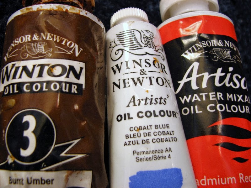
Student paints: such as Winton, are cheaper paints as they contain more filler and less pigment. They are generally for those new to the medium or on a budget.
Artist's paints: contain more pigment and are smoother to paint with but can be very expensive. Prices also seem to vary more depending on the colour.
Water-mixable oil paints are also now available as an option. These eliminate the need to have a solvent which saves on costs as well as odour. I do have a couple of tubes of these paints but I've yet to try them out so I don't know how different their paint is or how well they dry.
A good starting palette of colours would be warm and cool versions of the three primaries: red, yellow, and blue, white, and black (see previous blog post here). When painting wildlife the earth pigments (siennas, ochres, and umbers) can also be very useful. You'll find a few whites and blacks on sale which can be confusing, titanium white is the brightest white and lamp black the darkest black.
A little word of warning: I find it's harder to notice when you get oil paints on your skin than with water-based paints so it can be easy to unknowingly get it on your clothes and everywhere else in the room. So always make sure to check!
With oils you will most likely need to use a solvent to dilute and mix the paint as well as to rinse of paintbrushes. The exception to this would be if you are using water-mixable oils. This also helps you paint fat-over-lean which becomes important as your painting dries (more on that later).
Solvents can be damaging to the environment so make sure you absorb with rags or tissue and dispose of in general waste and NEVER tip down the sink.
Turpentine is traditionally used but you need to make sure you paint in a well-ventilated area as it is strongly odoured. An alternative is to use a low odour solvent such as Sansodor but this is more expensive.
White spirit can be used to rinse brushes as it is cheap but shouldn't be used as a painting medium as it is much more corrosive. It also produces fumes and binds less well with the paint.
While painting I find it best to pour some of the solvent into a glass jar to use. This prevents paint from brushes contaminating the rest of the solvent. Make sure to keep a lid on when you are not currently painting to prevent fumes and evaporation. Avoid storing in plastic containers as the solvent will eat the plastic away.
Linseed oil or Liquin, is used to add extra oil to paint. This allows for the build up of glazes in later layers and painting fat-over-lean. Liquin also speeds up drying times.
You will want a surface to squeeze out fresh paint onto so you can mix your colours. Avoid plastic as this will be corroded by the mediums and use wooden or glass palettes. Large palettes will give you more room to mix your paint on which is arguably more needed in oil painting than other mediums as the paint takes a longer time to dry on the palette. I find it best to put your colours around the edge of your palette and mix inside to prevent the paint from spreading out so much in all directions and so you know where the base colours are. Try not to put more paint than you need on your palette as will waste your paint.
An easel can be useful, particularly for larger work. You can get table easels as well as full tripod easels. For smaller works you can get away without using one.
Tissues are also useful to place wet brushes on as well as to wipe them dry.
Now how to start your painting!
How to paint:
It can be a good idea to sketch ideas out in a sketchbook before moving to canvas to come up with your painting's composition.
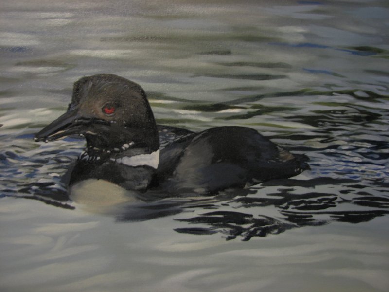
One method of composition is to use the rule of thirds. The idea behind the rule of thirds is that the canvas is divided into a 3 by 3 grid and the key focuses of the image should be the points where the grid intersects (see the dots in yellow on the painting below).
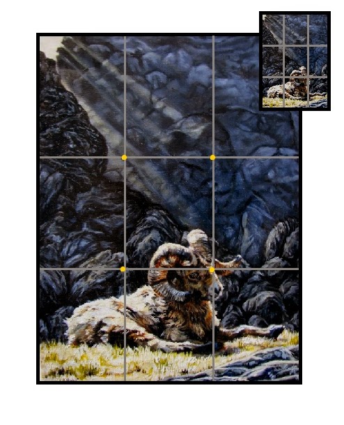 |
| Grid system & the rule of thirds |
Angles and lines of objects in the foreground and background lead the eye around the image. You can use them to focus on the features of your painting or to take them on a tour around it.
If you are working from references you will probably want to accurately transfer your idea onto your painting surface. You can do this by sketching the design using diluted paint, pencil or charcoal. If you use pencil or charcoal you will want to seal the drawing with a thin layer of acrylic paint or gesso to prevent the drawing from muddying your paint.
You can increase your sketch's accuracy by using a grid system to break down your reference and canvas into smaller chunks to transfer. Another option is to project your reference onto the canvas.
If it is likely or possible the painting will be later framed you will want to move the image inwards away from the edge of the painting area a little as the frame will crop the image space.
Angle of painting
Avoid painting on a horizontal surface such as a tabletop as this will likely skew the image's proportions based on your angle of viewing. This is why easels are useful tools to hold paintings.
Fat over lean painting
It is important to paint fat over lean in oil painting to prevent the paint surface from cracking whilst drying. What this means is that if you are painting using layers to build up paint on the canvas each subseqent layer needs to have a higher fat or oil content than the last. This can be done through diluting early layers with solvent and adding oils such as linseed to later layers.
Good things come to those who wait
Paint layers will vary in how long they take to dry based on added mediums and thickness of application. Expect relatively thin layers of paint with no medium to take a couple of days to dry. This will also vary based on the surface you are painting on. Be careful not to overwork a wet painting as this will likely end up muddying your colours and dilute your highlights and shadows. Wait for the layer to dry before starting the next.
Paint what only what you see..
..not what you think should be there. Putting details that you think should be visible but aren't actually visible from your references can actually take something away from your painting and make your image seem 'unreal'.
Lighting
Be aware of the temperature of light and complimentary colours. A warm orange sunset casts blueish shadows for example. Also pay attention to the direction of light and shadows, their depth and length and make sure they match.
Define your foreground
By softening your backgrounds you bring foreground objects forwards. Usually distant objects/landscape appear lighter than foreground objects as well as less detailed to the eye
The Mirror Trick
Something I call 'Painting Blindness'' occurs when you've been looking at a painting for a long time. This means problems within the image such as distorted proportions, and contrast can become difficult to notice. An easy way to double-check your image is to get a 'fresh look' at it using a mirror or to upload a photo of the painting and flip it horizontally using an image-editing program. That way you can see if there are mistakes you need to fix. Always carry out when you think your painting is done so you can make final touches as necessary.
Well I hope that helps. I'm not an expert but I've been using oils for about 10 years now so this is what I have managed to pick up. I personally don't believe art information is the privilege of the few to keep secret or dole out at a learner's cost. Indeed i think it's a shame that so much information remains unsaid in art institutions. I hope this provides a useful resource so a beginner can get started and enjoy what oil painters do!


